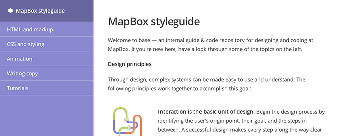
Base: a styleguide and CSS framework for MapBox
We just launched a complete redesign of mapbox.com. With it came an opportunity to re-think how we manage styles and assets across the components that make up mapbox.com. The goal is simple: if presentation should be consistent how much code can be shared? We should be able to easily make a change in one place and have it update the pieces that inherit it.
Enter base — an evolving styleguide and CSS framework we use internally to manage the many pieces that make mapbox.com. As a framework, base is small and well suited for our needs.

Composing with classes
Base works on an “as needed” basis. There are predefined rules for the consistent presentation of inline elements but widths & spacing, background fills, and colors are built using a combination of class names. It’s what’s styling our blog, so let’s compose a simple example right here.
<div class='clearfix space-bottom'>
 <nav class='col6 margin3 keyline-all round'>
 <a href='#' class='col12 pad1 keyline-bottom'>Item one</a>
 <a href='#' class='col12 pad1 keyline-bottom'>Item two</a>
 <a href='#' class='col12 pad1'>Item three</a>
 </nav>
</div>
And the end result.
With a little markup and class names, I’ve created a simple component with little effort. Here’s a slightly more complex example.
<div class='clearfix space-bottom'>
 <nav class='col6 margin3 keyline-all round clearfix'>
 <div class='col12 clearfix keyline-bottom'>
 <div class='col2 pad1y pad2x center'>
 <div class='big icon check dot dark fill-green'></div>
 </div>
 <div class='col10 pad2 pad1x '>Item one</div>
 </div>
 <div class='col12 clearfix keyline-bottom'>
 <div class='col2 pad1y pad2x center'>
 <div class='big icon plus dot fill-light'></div>
 </div>
 <div class='col10 pad2 pad1x quiet'>Item two</div>
 </div>
 <div class='col12 clearfix'>
 <div class='col2 pad1y pad2x center'>
 <div class='big icon plus dot fill-light'></div>
 </div>
 <div class='col10 pad2 pad1x quiet'>Item three</div>
 </div>
 </nav>
</div>
Item one
Item two
Item three
Mobile experience
We want the mobile experience on MapBox to be highly usable while eliminating desktop-centric interactions. Layout classes in base adapt to smaller screens by collapsing parent containers into a linear format. This linear layout has worked well for us. To manage other cases, there are mobile classes at our disposal as well.
Managing custom styes
Sometimes the design requirements for a page extend beyond what base provides us, like if we need custom graphic sprites. For these special cases our approach is to quarantine custom additions as much as possible to the page’s directory. For sites using Jekyll, another technique is to include any <head> level styling or scripts to a head value in the YAML front matter.
---
layout: default
title: Terms of service
head: |
 <style>
 .fancy-illustration { background:transparent url(/img/fancy-dancy.png) no-repeat 0 0; }
 </style>
---
At the root template the following line is added before the <head> tag:
{% if page.head %}{{ page.head }}{% endif %}
An evolving project
As we continue to grow, unifying our presentation and front end development is important. So far base has been working great for us, and we encourage you to borrow our ideas for your own development.


