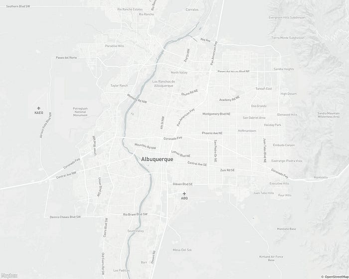
Mapbox Light refresh
Mapbox Light (and Dark) work best as underlays that complement visualizations of all sorts. However, we felt that our previous iterations had become somewhat stark, in terms of both data and design. In the course of planning this update, we decided to try and push these styles into a more visually and data rich direction. Perhaps most conspicuously, we have added a small amount of saturation to the major background elements. Previous versions had been limited to a range of greys, but we think that even a little bit of color goes a long way towards making the map less diagrammatic and easier to read.
We’re still fine tuning this work, but we hope that we have been able to add more visual information that bolsters Light’s use as an underlay without adding distracting or superfluous information.
Our cartography team is busy updating all our core styles. Over the next few weeks we’ll be sharing some of our thinking around how we’ve approached each style’s redesign. Stay tuned!

Mid-zoom view of Albuquerque’s road networks.

Transition from mountains to water on the San Francisco Peninsula.

