Mapping Donor Network West’s mission to heal
A second chance at life in your community
By: Lo Bénichou

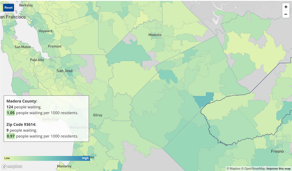
Donor Network West, the third largest federally designated organ procurement organization and one of the largest tissue recovery organizations in the nation, is taking a look at the numbers behind organ and tissue donation in California and Nevada. In an effort to raise awareness of the need for organ donors in different communities and to celebrate Donate for Life Month, Donor Network West partnered with the Mapbox Narratives Desk to create an interactive map showing residents in its service area how donation and transplantation impacts their communities.
The maps are powered by data from UNOS, OPTN, Donate Life California, Donate Life Nevada, and population data from the U.S. Census Bureau 2016 American Community Survey. We looked specifically at the 13 million people in the 40 counties served by Donor Network West. Explore the map to understand the needs in your community:
What we found
While building the map, a few things stuck out to us. As of today, nearly 10,000 people in Northern California and Nevada are awaiting a life-saving organ transplant. The availability of donors and those waiting for transplant varies greatly by county. For example, Fresno is the county with the most people waiting for a transplant with 1.32 people waiting per 1000 inhabitants. The county with the lowest rate is Plumas with 0.12 people waiting per 1000 inhabitants.
Looking at the map, we also saw a high correlation between donor registration and race. The data shows that a county with a higher number of white residents has a higher percentage of registration. On the other hand, a county with higher numbers of Hispanic residents is likely to have a lower donor registration rate. Other accounted factors such as median income and education had an extremely low correlation with the proportion of registered donors.
While the high correlation suggests a relationship between the proportion of white residents and registered donors, we cannot conclude that registered donors are disproportionately white without data on the racial breakdowns of registered donors.
This story is rich with data for you to examine. Take a look at the map, explore the data for yourself, and discover what you can do to help.


