Scary maps: A warning
By: Eric Gundersen

When you’re heading in the wrong direction, your map should tell you. I just landed home at SFO, sunrise was a thick haze with the smoke from the Camp Fire still burning up in Butte County. Today, maps are a giving us a warning. Showing not just where we are now, but the future we are heading toward. When we’re warned to the hazards on the road ahead, we have a chance to reroute in a different direction.
The air quality here is the worst in the world right now. Over breakfast, I convinced my boys that N95 masks were cool. I ordered them before I left, when the fires started. I’m lucky; the backlog on Amazon is now two weeks. Should have ordered them last year after the big fires in October but didn’t. This is starting to feel like a pattern.

Everyone is rubbing their eyes. The air is dry. Everything’s dry. California is as dry as it’s ever been this time of year. Up until last week, temperatures in the Bay Area were hitting the mid-70s every day. The forecast is finally calling for rain the day before Thanksgiving.
This data is dense. While hard to understand what, say, emissions data means, there’s something visceral about actually visualizing it. Or in the case of most of us in California today, just breathing and feeling it in our lungs.


We have to stop this. We need to look at the data to understand how to solve this at the root. The UN says that our ability to substantially bring down emissions by 2030 will determine if an Alaska-sized area of Arctic permafrost will melt (read: a lot more carbon in the atmosphere) or stay frozen. Today atmospheric CO2 is at 407 parts per million. That’s up almost 30% from 1960 when it was 320 ppm. Atmospheric methane (CH4) — which dissipates much faster than CO2, over a decade or two, but in that time traps about 70x more heat — has a concentration of about 1850 parts per billion today. That’s up from 1650 ppb in 1985. What does that actually look like?
This map from Bread For The World is striking, visualizing 12TB data set of global temperature data for 1950, today, and 2100 — assuming we maintain this killer pace of inaction — for everywhere in the world, broken into a million different points. An average global temperature rise of 8.5°C (about 15°F) means it’ll be routinely hitting 122°F in Saudi Arabia, and 110°F in Texas by 2100. To be honest that feels low, but the map and data are quite dramatic.
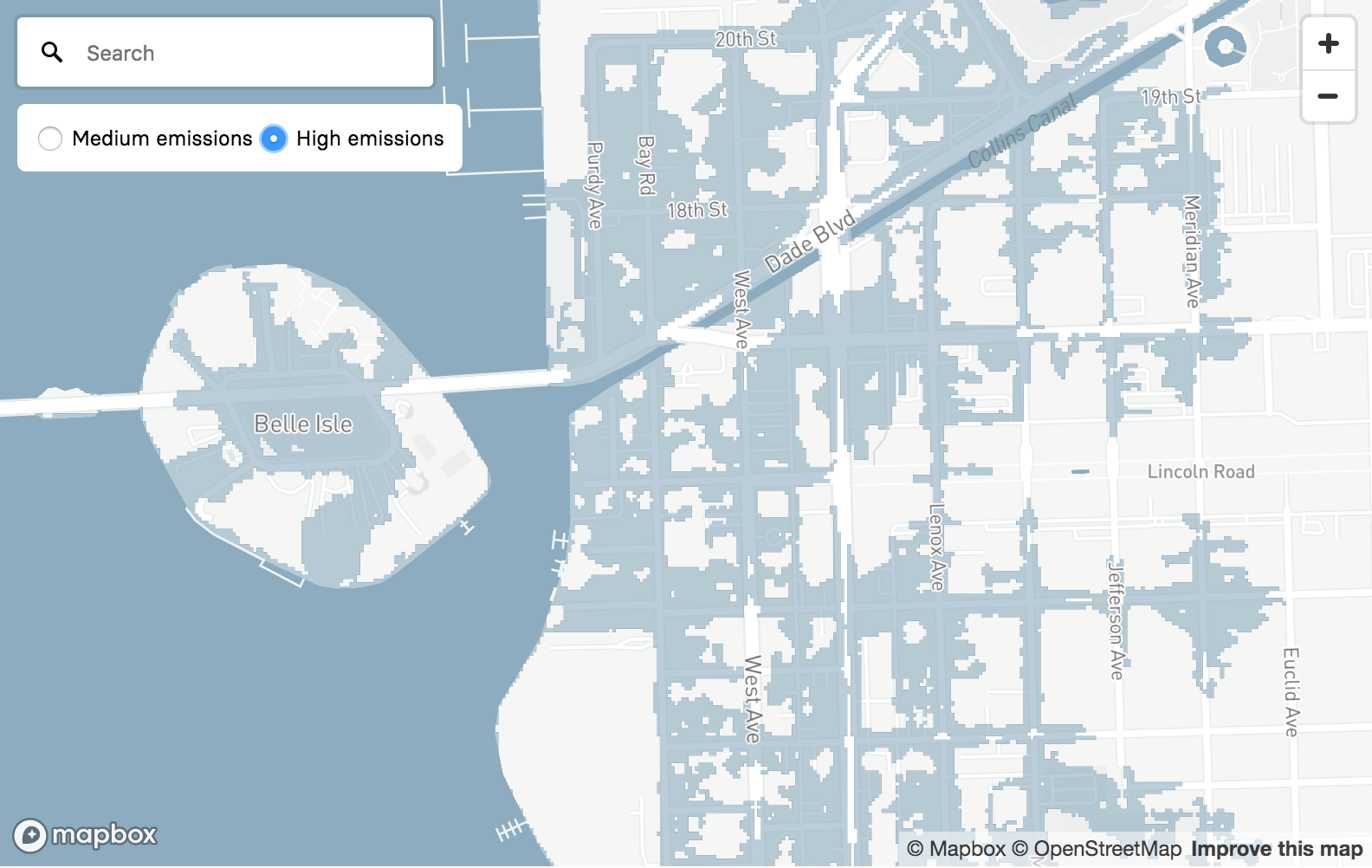
It was amazing working this week with BuzzFeed, Zillow, and Climate Central to visualize sea level rise and flood risk for 385,000 US homes that will be in routine flood zones by 2050, about the time when today’s home buyers will just finish paying off their home mortgage. It’s shocking to consider the amount of building that’s still going on in the highest risk areas. Since 2009, New Jersey has added 2,700 new homes in high-risk areas, currently worth about $2.6 billion. We’ve also been playing with different styles and data layers on a fire map, to track all the blazes in California and elsewhere. It’s scary.
If we want to make progress, science, data, and truth have to matter. People have to care, and for that they have to understand. I’m hopeful that maps can be part of telling a story in a way that resonates, that by visualizing a future we don’t want, we can find our way to a safer one. Let’s keep building for something better.

